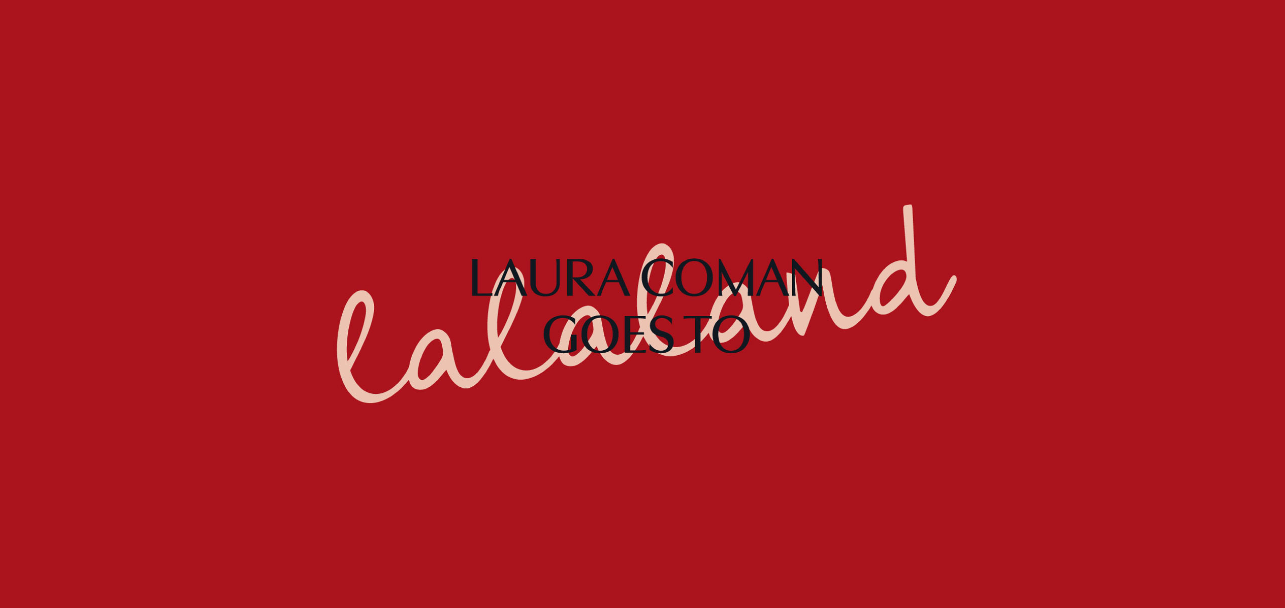
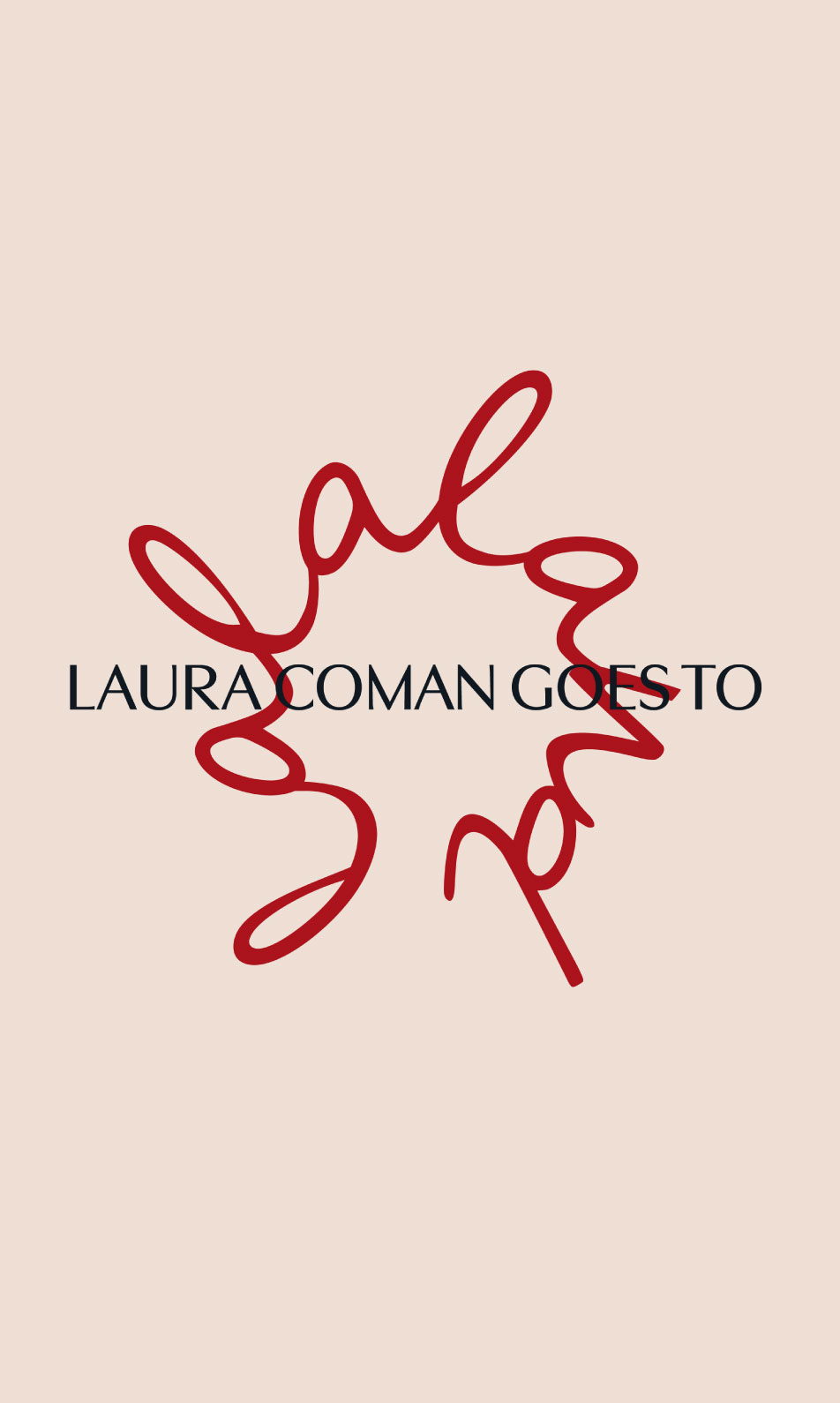
lalaland's logo serves as an invitation to healthy conversation aimed at unraveling thoughts. It features two versions, used at different communication stages.
The primary logo, employed at the beginning, is round, handwritten, thickened, symbolizing circularity, infinity, tangled thoughts, occasional confusion, humor, happiness, optimism, playfulness, and curiosity.
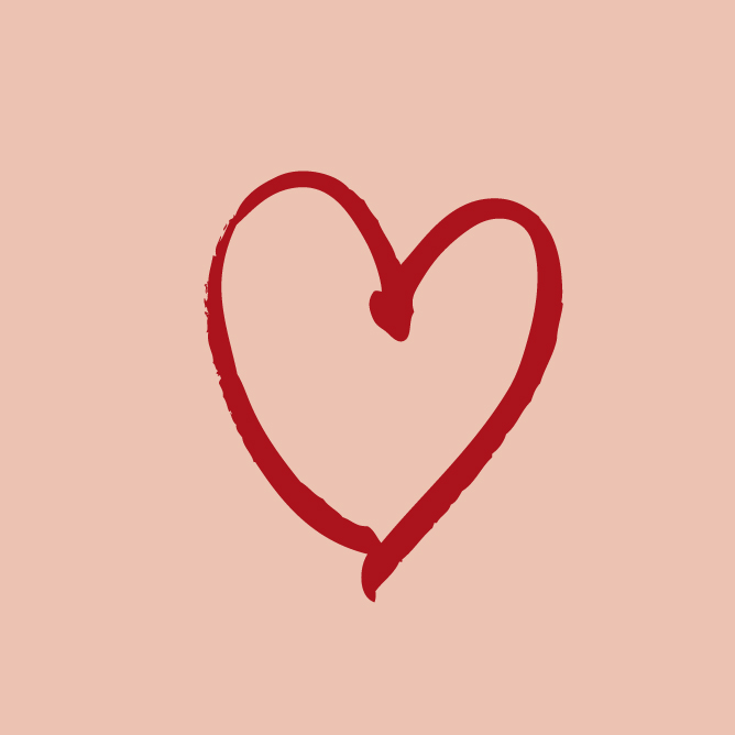
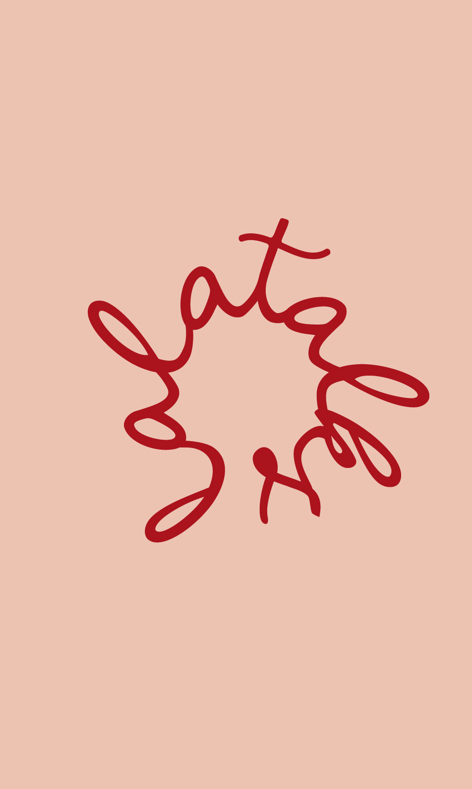
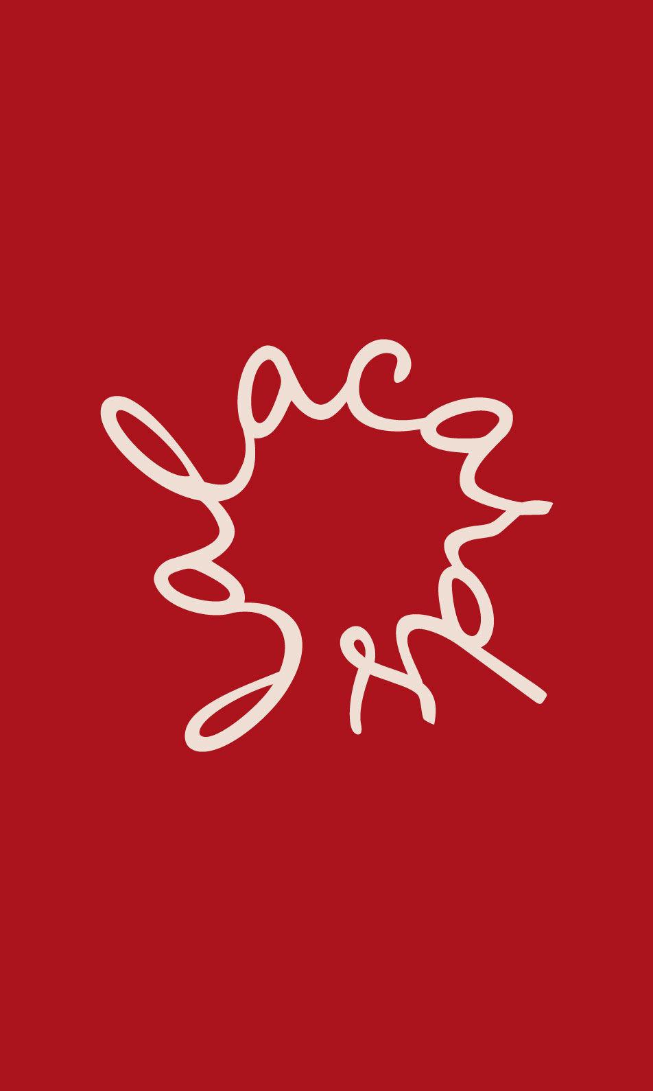
The secondary logo, used at the end of communications, is also handwritten and thickened. It signifies clarity after a good discussion, similar to putting thoughts in order, marking the conclusion of presentations or podcasts.”
Colours
Throughout the communication, the logo transitions from circular to linear, symbolizing the calming of thoughts after a good discussion where one felt understood.
Main colors include red for Laura’s depth and feelings; black for elegance and refinement; beige for peace and comfort; and pink for vulnerability and compassion.
Tone of Voice
In lalaland, we provide a safe and open space where every inner journey is greeted with joy and celebrated as an essential part of spiritual and emotional growth.
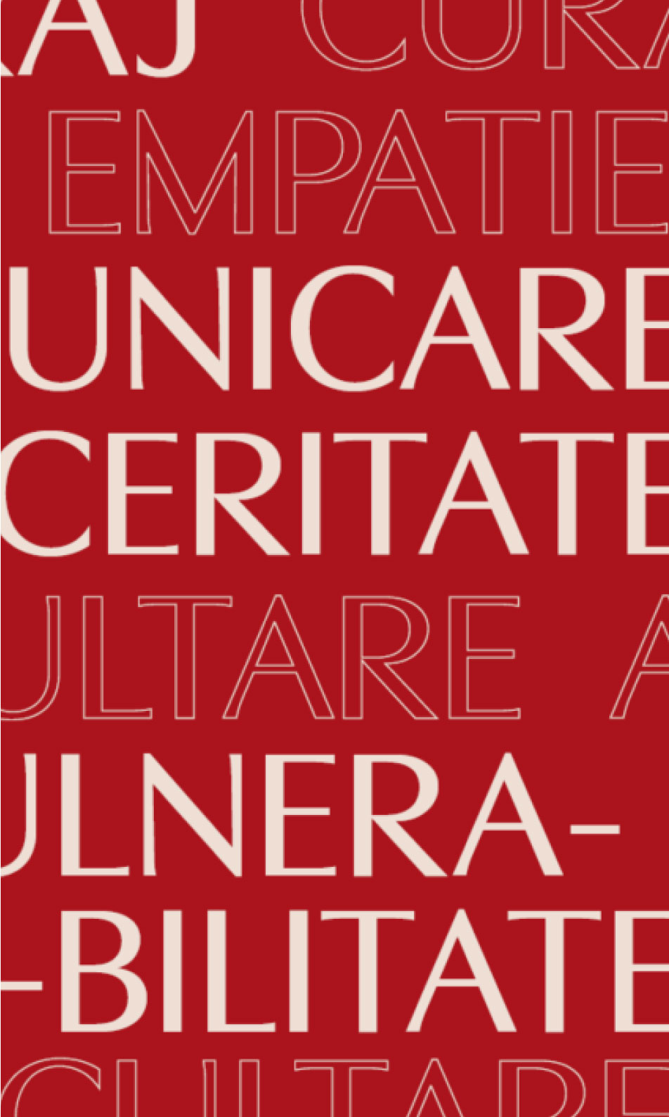
LIGHT & PLAYFUL | SERIOUS, BUT NOT TAKEN SERIOUSLY | CONSTRUCTIVE HUMOR | COMMERCIAL ENGAGEMENT | CONSTANT EXPLANATION & MISSION CLARITY | HEALTHY & NON-JUDGEMENTAL
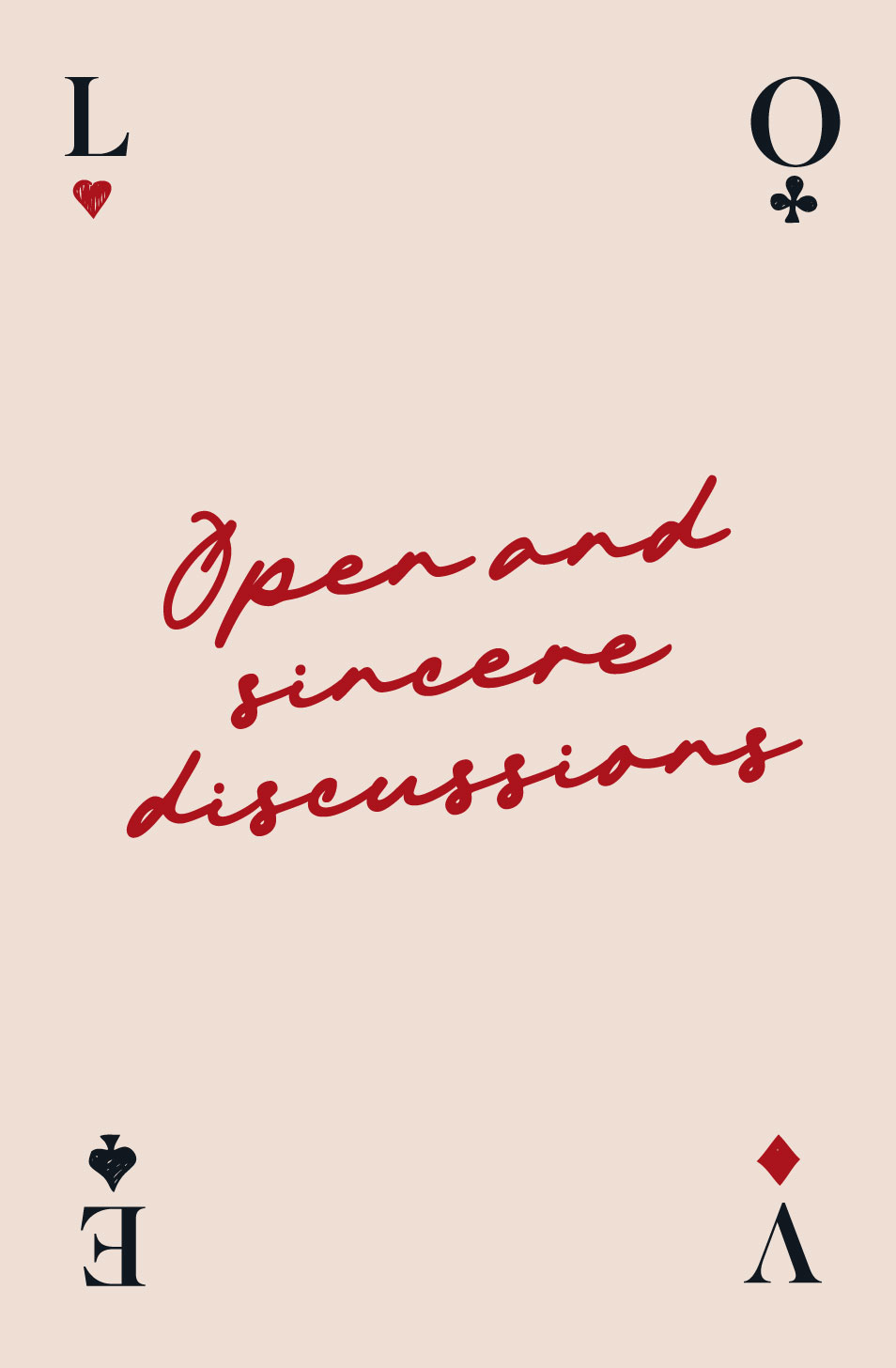
In lalaland we don't have pre-set answers, only sincere conversations that guide us towards authenticity and human connection
In lalaland we don't have pre-set answers, only sincere conversations that guide us towards authenticity and human connection