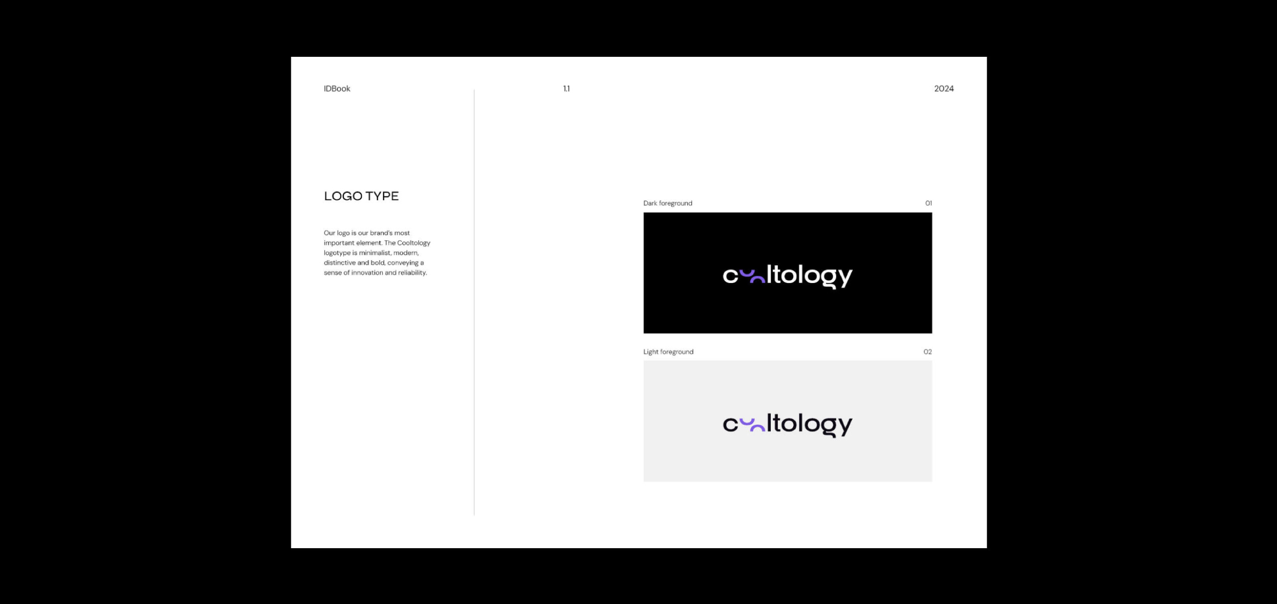
The Cooltology logotype features a minimalist and bold design, with the half-cut 'oo' from "coolt" symbolizing equilibrium and motion.
This design choice captures Cooltology’s commitment to balancing strategic insights with purposeful execution.
Violet, a color often associated with creativity and depth, reinforces the brand’s modernity and reliability, while the unique design elements convey a forward-thinking and dynamic approach to brand strategy.
Goal
In creating Cooltology's visual identity, the goal was to capture the brand's essence of blending culture, strategy, and innovation.
The minimalist and modern design reflects Cooltology’s commitment to bringing clarity to complex brand dynamics. By emphasizing bold and distinctive elements, the identity conveys both reliability and a forward-thinking approach. This approach ensures that Cooltology’s visual presence resonates with purpose-driven businesses and dreamers, effectively communicating its role in transforming brand strategy into authentic and impactful brand experiences.